

Your website analytics tell you what people do—how many visitors land on a page, how long they stay, where they bounce. But they rarely tell you why. Why do shoppers abandon their carts halfway through checkout? Why does that bright, beautiful call-to-action button get ignored? To answer questions like these, you need to actually see how people interact with your pages.
That’s where heatmap analysis comes in. By turning clicks, scrolls, and mouse movements into colorful visual overlays, heatmaps reveal the hidden patterns behind visitor behavior. They bridge the gap between cold numbers and real human decisions, giving you the context you need to make smarter design choices.
In this guide, we’ll break down what heatmap analysis is, the different types of heatmaps you can use, the best practices for getting accurate results, and the top tools to get started. Whether you’re refining a landing page or rethinking your entire customer journey, these insights will help you build a website that works harder for your visitors—and for your bottom line.
What Is Heatmap Analysis?
Heatmap analysis is the process of visualizing how visitors engage with a web page using color-coded data overlays. Warm colors (reds, oranges, and yellows) typically highlight areas of high activity, while cooler colors (blues and greens) indicate low engagement. At a glance, you can spot which elements grab attention and which ones get overlooked.
Unlike traditional metrics that aggregate data into tables and graphs, heatmaps show you behavior in context. You see exactly where people click, how far they scroll, and which sections hold their focus. This makes heatmap analysis one of the most accessible forms of user behavior analysis available—you don’t need to be a data scientist to interpret a heatmap.
The real value lies in connecting these visuals to action. If most visitors never scroll past the first screen, you know your key message needs to move up. If they keep clicking a non-clickable image, that’s a signal to add a link. Heatmaps translate raw interaction into clear, fixable problems.
The Main Types of Heatmaps
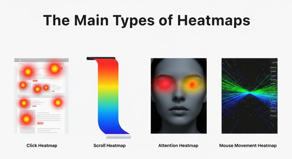 Not all heatmaps measure the same thing. Each type answers a different question about how people use your site. Understanding the distinctions helps you choose the right tool for the insight you’re after.
Click Maps
Click maps show where visitors click (or tap, on mobile) across a page. They reveal which buttons, links, and images attract the most attention—and which ones get ignored. Click maps are especially useful for spotting “false bottoms,” where users click on elements that look interactive but aren’t, or skip over your most important calls to action.
Scroll Maps
Scroll maps illustrate how far down a page visitors travel before leaving. They highlight the “fold”—the point where a large chunk of your audience drops off. If critical content sits below the average scroll depth, scroll maps make a strong case for moving it higher. This insight is central to user experience optimization, since it ensures your most valuable information actually gets seen.
Move Maps
Move maps (sometimes called hover maps) track mouse movement across a page. Research suggests that cursor position often loosely follows where people are looking, so move maps can hint at which areas draw the eye. They’re best treated as a supporting signal rather than a definitive one, since mouse and eye movement don’t always align.
Attention and Engagement Maps
These maps combine scroll depth and time spent to show which sections hold visitor attention the longest. They’re handy for evaluating long-form content, helping you identify the sections people actually read versus the ones they skim past.
Why Heatmap Analysis Matters for Your Business
 Heatmaps do more than satisfy curiosity. They directly support better decisions across design, marketing, and conversion strategy.
First, they remove guesswork. Instead of debating where to place a button based on opinion, you can look at real behavior and let the data settle the argument. This shifts conversations from “I think” to “I know.”
Second, heatmaps strengthen customer journey optimization. By studying how visitors move through individual pages, you can identify friction points that interrupt their path—confusing navigation, distracting elements, or content that fails to load attention where you want it. Smoothing out these snags keeps people moving toward conversion.
Third, heatmaps make A/B testing more meaningful. Numbers might tell you that version B outperformed version A, but a heatmap shows you why. Maybe the winning layout drew clicks to a clearer headline or guided eyes toward the signup form. That deeper understanding helps you replicate success across other pages.
Finally, heatmaps support accessibility and usability improvements. When you see that visitors struggle to find a feature or repeatedly miss an important link, you gain concrete evidence to justify a redesign.
Best Practices for Effective Heatmap Analysis
 Collecting heatmap data is easy. Drawing the right conclusions takes a bit more discipline. Follow these best practices to get reliable, actionable results.
Gather Enough Data Before Drawing Conclusions
A heatmap built on 50 visits won’t tell you much. Small samples produce noisy, misleading patterns. As a rough guideline, aim for at least 2,000 to 3,000 page views before you analyze a desktop heatmap, and a similar volume for mobile. Higher-traffic pages can reach statistical reliability faster, while low-traffic pages may need weeks of collection.
Segment Your Audience
A single heatmap blends every visitor into one picture, which can hide important differences. New visitors behave differently from returning ones. Mobile users interact differently from desktop users. Traffic from a paid ad campaign may have different intent than organic search traffic. Segmenting your heatmaps by device, source, or audience type sharpens your user behavior analysis and prevents misleading averages.
Analyze Devices Separately
Never combine desktop and mobile data into one heatmap. Layouts, screen sizes, and interaction methods differ too much. A button that performs well on desktop might fall below the fold on a phone. Always view mobile, tablet, and desktop heatmaps as distinct datasets.
Pair Heatmaps with Other Data
Heatmaps are powerful, but they work best alongside other tools. Combine them with traditional analytics, session recordings, and direct user feedback. If a heatmap shows people abandoning a form, a session recording might reveal that a specific field causes confusion. Layering these sources gives you the full story.
Form a Hypothesis, Then Test It
Treat heatmaps as a starting point, not a final verdict. When you spot a pattern—say, a CTA that nobody clicks—form a hypothesis about why, make a change, and run an A/B test to confirm it. This turns observation into measurable improvement and keeps your user experience optimization grounded in evidence.
Revisit Heatmaps After Changes
Behavior shifts after you redesign a page. Once you’ve implemented changes, run a fresh heatmap to confirm they had the intended effect. Heatmap analysis works best as an ongoing cycle, not a one-time audit.
Top Tools for Heatmap Analysis
A growing range of tools makes heatmap analysis accessible to teams of every size. Here are some of the most popular options and what they do well.
Hotjar
Hotjar is one of the best-known names in the space, popular for its clean interface and beginner-friendly setup. It offers click maps, scroll maps, and move maps, plus session recordings and on-site surveys. Choose Hotjar if you want an all-in-one platform that blends visual heatmaps with qualitative feedback.
Crazy Egg
Crazy Egg pioneered the modern heatmap and remains a strong choice for marketers focused on conversion. Alongside standard heatmaps, it offers a “Confetti” report that breaks down clicks by traffic source, plus built-in A/B testing. It’s a solid pick for teams that want testing and visualization in one place.
Microsoft Clarity
Microsoft Clarity stands out for one major reason: it’s completely free, with no traffic limits. It delivers click maps, scroll maps, and session recordings, along with metrics that flag frustration signals like rage clicks and dead clicks. For budget-conscious teams or anyone testing the waters, Clarity is hard to beat.
Mouseflow
Mouseflow offers six types of heatmaps, including movement and attention maps, plus funnel analysis and form analytics. It’s well suited to teams that want deeper customer journey optimization and granular insight into how forms perform.
Smartlook
Smartlook focuses on combining heatmaps with detailed session recordings and event tracking. It works for both websites and mobile apps, making it a versatile choice for product teams managing experiences across multiple platforms.
FAQ: Heatmap Analysis
1. What is heatmap analysis?
Heatmap analysis is a visual method of tracking user behavior on websites. It uses color-coded overlays to show where visitors click, scroll, hover, and spend the most time on a page.
2. Why is heatmap analysis important for websites?
Heatmap analysis helps businesses understand user behavior beyond basic analytics. It identifies friction points, highlights popular content, and reveals opportunities to improve user experience, engagement, and conversion rates.
3. What are the main types of heatmaps?
The main types include click maps, scroll maps, move maps, and attention maps. Each provides different insights, helping website owners understand how users interact with content and navigation elements.
4. How many visitors do I need for accurate heatmap data?
For reliable results, collect at least 2,000 to 3,000 page views per device type. Larger sample sizes reduce noise and provide clearer insights into genuine user behavior patterns.
5. Can heatmaps improve conversion rates?
Yes. Heatmaps reveal where users hesitate, abandon pages, or ignore important elements. By optimizing layouts and calls to action based on these insights, businesses can significantly improve conversions.
6. Are heatmaps better than traditional analytics?
Heatmaps and traditional analytics serve different purposes. Analytics explain what users do, while heatmaps show how they interact with specific page elements. Using both together delivers deeper and more actionable insights.
7. Should I analyze mobile and desktop heatmaps separately?
Absolutely. Mobile and desktop users behave differently because of screen sizes and navigation styles. Separate heatmaps provide more accurate insights and help optimize experiences for each device category.
8. Which heatmap tool is best for beginners?
Microsoft Clarity and Hotjar are excellent choices for beginners. They offer intuitive dashboards, essential heatmap features, and session recordings that make it easy to understand visitor behavior quickly.
9. Can heatmap analysis help improve SEO?
Indirectly, yes. Heatmaps help improve user experience, content placement, and engagement. Better user satisfaction can reduce bounce rates and increase time on site, which supports overall SEO performance.
10. How often should I perform heatmap analysis?
Heatmap analysis should be an ongoing process. Review heatmaps regularly, especially after redesigns or marketing campaigns, to track behavioral changes and continuously optimize your website for better results.
Turning Insights into Action
Heatmap analysis is one of the clearest windows into the minds of your visitors. By visualizing clicks, scrolls, and attention, you uncover the why behind your metrics and gain the evidence to make confident design decisions. The result is a website that guides people smoothly toward the actions you want them to take.
To get the most from your heatmaps, start small and stay consistent. Pick one high-traffic page that matters to your business—a landing page, a product page, or your checkout flow. Install a tool like Microsoft Clarity or Hotjar, collect enough data to trust the patterns, and look for one clear opportunity to improve. Make the change, then run a fresh heatmap to measure the impact. Done right, heatmap analysis becomes a continuous loop of insight and improvement, fueling smarter user experience optimization and a customer journey that converts. Choose your first page, set up your tool, and let your visitors show you exactly what they need.