

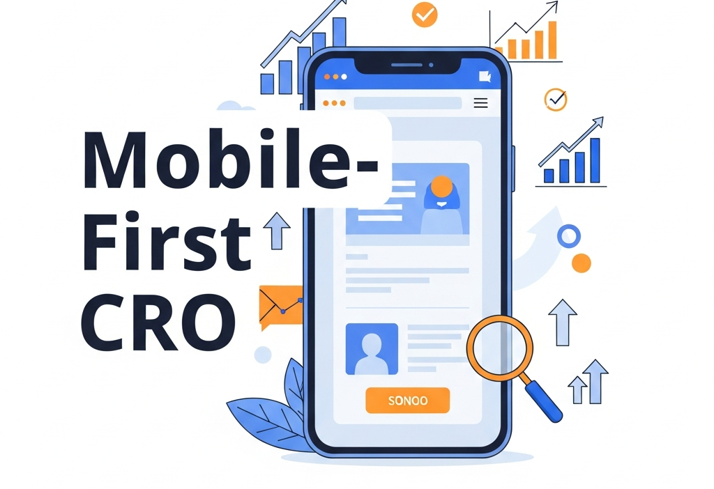
In today’s digital landscape, mobile devices drive over half of all web traffic, making mobile performance a cornerstone of any effective online strategy. Mobile-first CRO, or mobile-first conversion rate optimization, shifts the traditional desktop-centric mindset and places smartphone and tablet user experiences at the forefront of design and testing. By prioritizing performance and usability on small screens, businesses can engage visitors faster, reduce friction, and ultimately boost conversion rates. This comprehensive guide will walk you through proven strategies, best practices, and top tools to implement a mobile-first CRO approach. Whether you’re launching a new site or refining an existing one, these insights will help you unlock higher engagement and seamless conversion journeys for mobile users today.
Understanding the Importance of a Mobile-First Mindset
 Conventional CRO methods often begin with a desktop layout and then retrofit elements for smaller screens. This backward approach can lead to performance bottlenecks, cramped interfaces, and lost opportunities on mobile devices. By contrast, mobile-first CRO designs from the ground up with mobile constraints such as limited bandwidth, touch inputs, and simplified navigation in mind. The benefits of adopting this mindset are significant:
- Faster Load Times: Optimizing images, minimizing scripts, and leveraging caching ensures quick page rendering under variable mobile networks.
- Improved User Engagement: Streamlined menus, clear calls-to-action, and thumb-friendly interactions reduce cognitive load and encourage deeper browsing.
- Enhanced SEO Performance: Search engines like Google prioritize mobile-optimized pages in their indexing algorithms, granting higher visibility to well-designed mobile experiences.
By meeting users where they are—on the go, with limited screen real estate—you position your site to deliver swift, intuitive journeys that guide visitors smoothly toward conversion.
Designing Thumb-Friendly Navigation
Effective navigation is the backbone of any mobile-first CRO strategy. In today’s fast-paced environment, users expect to find information quickly using only their thumbs. Implement these design principles to create intuitive pathways:
- Bottom Navigation Bars: Place primary actions and menu items within easy reach of the thumb. A bottom-bar layout reduces strain and minimizes accidental taps.
- Clear and Concise Labels: Use straightforward labels like “Shop” or “Sign Up” to ensure visitors understand each button’s purpose at a glance.
- Progressive Disclosure: Hide secondary options under expandable panels or accordions to prevent clutter on initial views.
- Iconography and Visual Cues: Combine universally recognized icons (e.g., shopping cart, search) with text labels to enhance comprehension.
- Consistent Touch Targets: Maintain a minimum tappable area of 44×44 pixels to reduce mis-taps. Ensure sufficient spacing between interactive elements.
By prioritizing intuitive navigation and leveraging touch-optimized design patterns, you’ll lower friction and encourage users to explore deeper within your site.
Streamlining Mobile Forms for Higher Conversions
Forms on mobile can be a major pain point if they aren’t optimized for small screens. Lengthy fields and awkward keyboards often lead to form abandonment. To maximize submissions this year (2026), apply these tactics:
- Minimalist Field Sets: Only request essential information. Combine related fields (e.g., first and last name) to reduce perceived effort.
- Adaptive Input Types: Use HTML5 input types (
email,tel,date) to trigger appropriate keyboards and enhance user convenience. - Auto-Complete and Auto-Fill: Implement browser auto-complete attributes and leverage password managers to speed up form completion.
- In-Line Validation: Provide real-time feedback for incorrect entries, preventing frustration at submission time.
- Single-Column Layouts: Display fields in a vertical stack to accommodate narrow viewports and avoid horizontal scrolling.
Optimizing your forms with these strategies reduces drop-offs and helps mobile users complete critical actions smoothly.
Speed and Performance Optimization Techniques
In mobile-first CRO, every millisecond counts—studies show that a one-second delay can lead to a 20% drop in conversions. To ensure your site loads rapidly on varied network conditions, implement the following best practices:
- Image Optimization: Use responsive
<picture>elements, WebP format, and lazy loading to deliver appropriately sized images. Tools like Google’s Web Fundamentals provide detailed guidance. - Code Minification and Bundling: Remove whitespace, comments, and unused CSS/JS. Combine files strategically to reduce HTTP requests.
- Content Delivery Network (CDN): Distribute static assets via global edge servers to minimize latency. Services such as Cloudflare and AWS CloudFront can significantly boost performance.
- Critical CSS Inlining: Inline essential above-the-fold styles and defer non-critical CSS to accelerate first paint times.
- Progressive Web Apps (PWA) and Accelerated Mobile Pages (AMP): Consider PWAs for app-like experiences with offline support and AMP for near-instant loading on content-focused pages.
By applying these performance optimizations, you’ll deliver a fast, seamless experience that retains mobile visitors and encourages deeper engagement.
Advanced Mobile-First Strategies

Implementing Responsive Layouts and Fluid Grids
Responsive design is essential for accommodating the diverse screen sizes in today’s mobile ecosystem. A flexible layout enhances user satisfaction and ensures consistent branding across devices. Key strategies include:
- Fluid Grid Systems: Adopt percentage-based widths rather than fixed pixel values. This allows containers to resize smoothly as the viewport changes.
- Media Queries Based on Content: Define breakpoints according to content needs (e.g., typography scaling, image resizing), not just device models.
- Adaptive Images: Use the
<source>element within<picture>to serve device-specific images, reducing download sizes. - Modular Components: Build reusable UI components that adapt their layout based on available space, ensuring consistency and faster development.
- Cross-Device Testing: Verify designs using browser developer tools, emulators, and real devices for pixel-perfect results.
Combining these responsive techniques ensures that your site offers an elegant, accessible interface regardless of the user’s device dimensions.
Running Effective Mobile A/B Tests
A/B testing is at the heart of data-driven mobile-first CRO. By experimenting with variations tailored for mobile, you can identify what truly resonates with users. Follow these guidelines when planning your tests:
- Hypothesis-Driven Testing: Formulate clear hypotheses. For example, “Will a sticky bottom CTA button increase newsletter sign-ups on mobile?”
- Device Segmentation: If user behavior differs significantly between Android and iOS, run separate experiments to obtain precise insights.
- Single-Variable Isolation: Test one element at a time—button color, form length, or title phrasing—to pinpoint the root cause of any performance change.
- Mobile-Specific KPIs: Focus on conversion rate, bounce rate, average session duration, and scroll depth for mobile traffic.
- Gradual Rollouts: Once a variant proves successful, incrementally release it to the broader audience to minimize risk.
Leveraging the right A/B testing tools—such as Optimizely or VWO—enables you to validate assumptions and refine your mobile-first strategy iteratively.
Leveraging Personalized Experiences on Mobile
Personalization can significantly enhance conversions by delivering relevant content and offers to each visitor. On mobile, where screen space is at a premium, targeted messaging becomes even more critical. Consider these tactics:
- Geo-Targeted Promotions: Display localized offers or store locators based on a user’s real-time location.
- Behavioral Triggers: Use scroll-depth or exit-intent triggers to present contextually relevant popups or banners on mobile.
- Purchase History-Based Recommendations: Suggest products or content tailored to each user’s past interactions.
- In-App Messaging and Push Notifications: For businesses with mobile apps, re-engage users through timely, personalized messages delivered directly to their device.
By harnessing user data and implementing dynamic personalization, you can elevate the mobile experience and drive meaningful conversions.
Essential Tools and Analytics for Mobile-First CRO
To measure, analyze, and optimize your mobile-first efforts, leverage specialized platforms that provide actionable insights:
- Google Analytics 4: Configure mobile events, funnel visualizations, and user properties to track behavior across devices and channels.
- Hotjar or Crazy Egg: Generate heatmaps, scrollmaps, and session recordings to identify friction points in mobile flows.
- Optimizely / VWO: Run device-specific A/B tests and feature flags to validate design changes on mobile.
- Lighthouse & WebPageTest: Conduct audits for performance metrics such as Time to Interactive (TTI) and Largest Contentful Paint (LCP).
- Firebase & Adjust: Monitor app installs, in-app events, and engagement funnels for mobile applications.
Combining these analytics and testing tools helps you uncover user behavior patterns, diagnose issues, and iterate based on solid data.
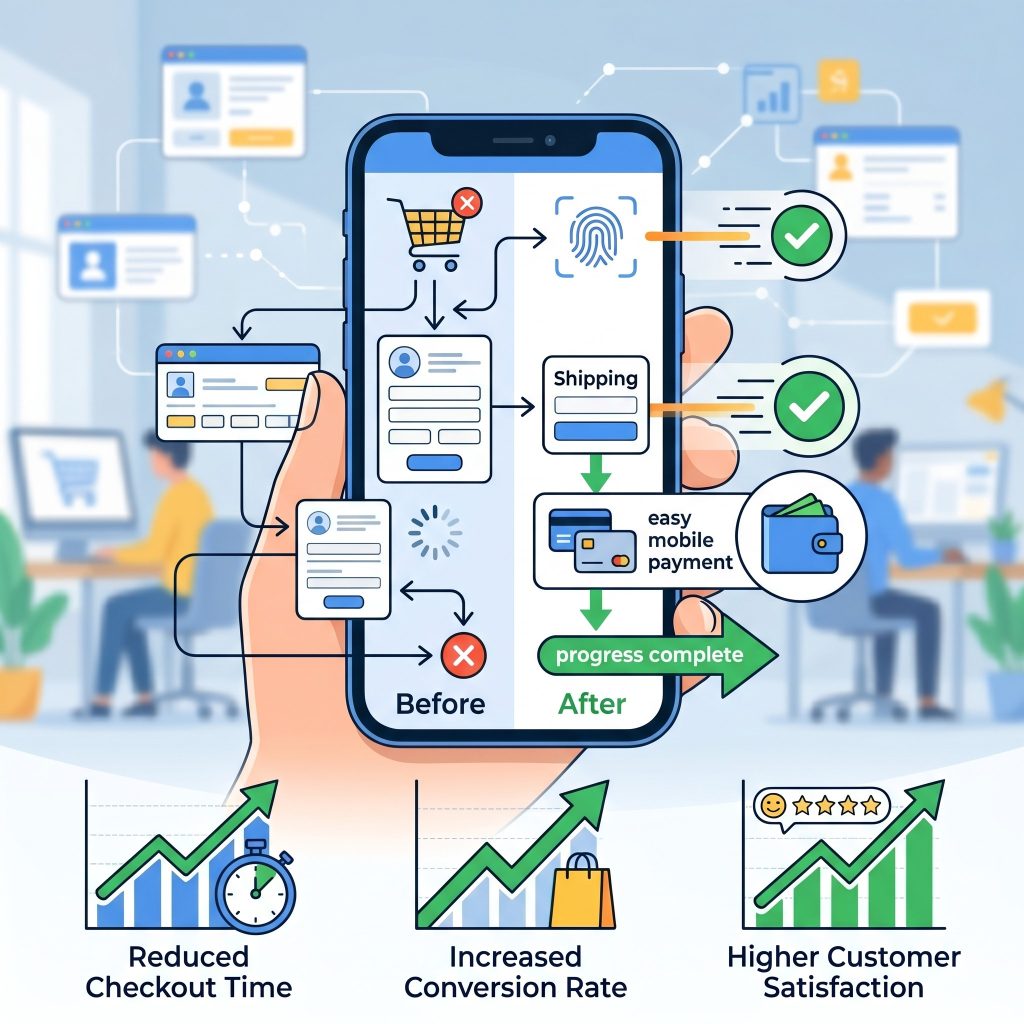 A seamless checkout process is critical for mobile-first CRO success because complicated payment flows often cause cart abandonment. Businesses should simplify checkout pages by reducing unnecessary steps, enabling guest checkout options, and integrating trusted payment gateways such as digital wallets and one-click payment systems. Mobile shoppers expect convenience, speed, and security during transactions. Clear progress indicators and autofill support can further improve usability and reduce frustration. Additionally, displaying trust badges, secure payment icons, and concise return policies reassures customers during purchases. By minimizing distractions and optimizing checkout functionality for smaller screens, businesses can significantly improve customer satisfaction, reduce abandonment rates, and increase overall mobile conversion performance.
 Continuous monitoring of mobile user behavior helps businesses identify friction points and optimize conversion paths effectively. Analytics platforms and heatmap tools reveal how users navigate pages, interact with buttons, and abandon forms or checkout processes. Monitoring metrics such as bounce rates, session duration, click-through rates, and scroll depth provides valuable insights into mobile performance. Businesses should regularly review this data to detect usability issues and adjust layouts, messaging, or navigation accordingly. User behavior trends may change over time as technology and customer expectations evolve. Ongoing analysis and optimization ensure that mobile experiences remain fast, intuitive, engaging, and capable of delivering strong conversion results consistently.
Frequently Asked Questions
What is mobile-first CRO?
Mobile-first CRO focuses on optimizing websites for smartphones and tablets before desktop devices. It improves mobile usability, speeds up loading times, reduces friction, and increases conversions by prioritizing the mobile user experience throughout design and testing.
Why is mobile-first optimization important?
Mobile-first optimization is important because most web traffic now comes from mobile devices. A fast, user-friendly mobile experience improves engagement, reduces bounce rates, boosts search engine rankings, and increases conversions across websites and online stores.
How can I improve mobile website speed?
You can improve speed by compressing images, minimizing CSS and JavaScript files, using lazy loading, enabling browser caching, and implementing a content delivery network. Faster websites create better mobile experiences and improve conversion performance.
What are the best practices for mobile forms?
Effective mobile forms use fewer fields, single-column layouts, auto-fill support, adaptive keyboards, and real-time validation. These practices simplify form completion, reduce frustration, and encourage users to finish registrations, purchases, or contact requests successfully.
Which tools help with mobile-first CRO?
Popular tools include Google Analytics 4, Hotjar, Crazy Egg, Optimizely, VWO, Lighthouse, and WebPageTest. These platforms help businesses analyze mobile behavior, run A/B tests, monitor performance, and identify conversion bottlenecks effectively.
Conclusion
Embracing mobile-first CRO is essential for thriving in today’s mobile-dominated environment. By rethinking design from the smallest screens upward, you can deliver lightning-fast load times, intuitive thumb-friendly navigation, and highly relevant experiences that guide visitors toward conversion. Implement responsive layouts, optimize forms, and leverage data-driven experimentation to refine every aspect of your mobile journey. With the right best practices and tools in place, you’ll unlock significant boosts in engagement and revenue. Start applying these mobile-first strategies today, and watch your conversion rates soar.
Read more about this topic: Data-Driven Conversion Rate Optimization Case Studies