

Website Conversion Barriers are the problems, friction points, and usability issues that prevent visitors from completing valuable actions on a website. These actions may include purchasing a product, submitting a form, booking a service, signing up for an account, or requesting more information. Even when a website receives substantial traffic, conversion barriers can prevent that traffic from producing meaningful business results.
A visitor may leave because a page loads slowly, a checkout process feels complicated, important information is difficult to find, or the website does not provide enough confidence to complete an action. Identifying these problems allows businesses to improve the customer journey and create a smoother path toward conversion.
What Are Website Conversion Barriers?
Website conversion barriers are anything that creates unnecessary difficulty between a visitor and the action a business wants them to take. These barriers can appear in website design, navigation, content, forms, checkout processes, technical performance, or overall user experience.
Common Types of Conversion Barriers
Conversion barriers can be technical, functional, psychological, or informational. A slow website represents a technical barrier, while confusing navigation creates a usability barrier. Lack of reviews or security information can create a trust barrier.
Some websites also make visitors work too hard to understand their offers. If users cannot quickly determine what a product does, why it matters, or what they should do next, they may leave before converting.
Slow Page Loading and Poor Website Performance
 Website speed has a direct impact on the experience visitors receive. When pages take too long to load, users may become frustrated before they even see the content. This is particularly important for mobile visitors who may be using slower or less stable connections.
Why Page Speed Matters for Conversions
A slow page can interrupt the customer journey at critical moments. Visitors may abandon landing pages, product pages, forms, or checkout screens before completing their intended action.
Page speed optimization can involve improving image sizes, reducing unnecessary scripts, optimizing code, improving hosting performance, and reducing other technical elements that delay page rendering. Faster experiences can make websites easier to navigate and interact with. Businesses should pay particular attention to pages that generate conversions. Improving the loading experience on product, pricing, registration, and checkout pages can remove an important source of friction.
Complicated Navigation and Website Structure
Visitors should be able to find important information without unnecessary effort. Complicated menus, unclear categories, excessive navigation options, and inconsistent page structures can make websites difficult to use.
Creating a Clearer User Journey
A strong website structure helps visitors move naturally from discovering information to taking action. Navigation should support the user’s objective rather than forcing visitors to search through multiple unrelated pages.
Important pages such as products, services, pricing, contact information, and checkout should be easy to access. Internal links and clear navigation labels can also help visitors understand where they are and where they can go next. When users can move through the website with less confusion, businesses can remove unnecessary friction from the conversion journey.
Weak or Unclear Calls to Action
A call to action tells visitors what they can do next. Examples include “Buy Now,” “Get Started,” “Request a Quote,” “Book a Consultation,” and “Download the Guide.”
Making Calls to Action More Effective
A weak CTA may not communicate enough value or may be difficult to notice. Multiple competing CTAs can also confuse users about which action is most important.
Businesses should connect each CTA with the user’s stage in the journey. A visitor reading an educational article may be more comfortable with “Learn More” than an aggressive purchase request. CTA placement, wording, visibility, and relevance should work together. The goal is to make the next step obvious without creating unnecessary pressure.
Poor Mobile Experience
A significant portion of website traffic can come from mobile devices, making responsive design an essential part of conversion optimization. A website that looks acceptable on desktop but performs poorly on smartphones can create serious conversion barriers.
Mobile Issues That Affect Conversions
Small buttons, difficult-to-read text, horizontal scrolling, poorly formatted forms, intrusive pop-ups, and slow mobile loading can make websites frustrating to use.
Mobile visitors should be able to read content, navigate pages, complete forms, and interact with important elements without excessive zooming or scrolling. Testing websites on different screen sizes can reveal usability problems that may not be obvious during desktop testing.
Confusing Forms and Checkout Processes
Forms are often necessary for lead generation, registration, bookings, and other conversions. However, requesting too much information can discourage visitors from completing them.
Simplifying Forms
Businesses should evaluate whether every form field is genuinely necessary. Removing unnecessary questions can reduce the amount of effort required from visitors.
Checkout processes can create even greater friction. Unexpected fees, complicated account requirements, limited payment options, unclear shipping information, and lengthy checkout steps may cause visitors to leave. A simpler checkout experience can help businesses reduce cart abandonment by removing unnecessary obstacles between product selection and purchase completion.
Lack of Trust and Credibility
Visitors may hesitate to convert when they are uncertain about the company, product, service, or payment process. Trust becomes particularly important when visitors are asked to provide personal information or make a financial commitment.
Building Trust Throughout the Website
Customer reviews, testimonials, transparent policies, secure payment information, contact details, guarantees where appropriate, and clear business information can help reduce uncertainty.
Trust signals should appear at relevant points in the customer journey rather than being hidden on separate pages. For example, checkout pages can include concise information about payment security, returns, shipping, or support. A website does not need excessive trust elements. They should be relevant, clear, and easy to understand.
Weak Value Propositions
A value proposition explains what a business offers, who it helps, and why visitors should consider taking action. If this information is unclear, visitors may struggle to understand the benefit of continuing.
Communicating Value Clearly
A strong value proposition should be easy to understand without requiring visitors to study large amounts of text. The headline, supporting message, and CTA should work together to communicate the central benefit.
Instead of focusing only on features, businesses can explain the outcomes those features provide. Clear product benefits can help visitors determine whether an offer matches their needs. The value proposition should also remain consistent across advertisements, landing pages, product pages, and other customer touchpoints.
Poor Content and Information Gaps
Visitors often need specific information before making a decision. If a website does not answer important questions, users may leave to search elsewhere.
Providing Decision-Making Information
Product pages may need details about features, pricing, specifications, availability, delivery, returns, and support. Service websites may need information about processes, timelines, pricing models, experience, and frequently asked questions.
Content should address the questions that matter at each stage of the customer journey. Clear explanations can reduce uncertainty and help visitors move closer to conversion. Businesses should also avoid excessive jargon. Straightforward language can make important information easier to understand.
Too Many Distractions
A website can contain useful elements while still becoming difficult to use when too many competing components appear on the same page. Multiple banners, pop-ups, animations, promotional messages, and CTAs can distract visitors from the primary conversion goal.
Creating a Focused Conversion Experience
Each important page should have a clear purpose. Landing pages designed for lead generation should guide visitors toward the intended form or CTA rather than presenting numerous unrelated options.
Visual hierarchy can help visitors understand what deserves attention first. Headings, spacing, buttons, images, and supporting information should work together instead of competing for attention. Removing unnecessary distractions can make the conversion path easier to understand.
How Website Experiments Can Identify Conversion Barriers
 Businesses do not always know which website element is preventing conversions. Assumptions can lead to changes that have little impact. Data-driven testing can provide stronger evidence.
Using Website Experiments for Optimization
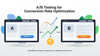
Website experiments allow businesses to compare different versions of pages, headlines, CTAs, forms, layouts, or other elements. A controlled test can help determine whether a specific change produces a meaningful difference in user behavior.
For example, a business might test a shorter form against a longer form or compare two different CTA messages. The goal is not simply to make a page look different but to understand how specific changes affect user actions.
Testing should be based on a clear hypothesis and relevant conversion metric. Results should be interpreted carefully rather than relying on small or temporary changes.
How to Find Website Conversion Barriers
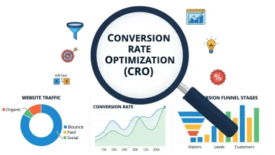
Identifying conversion barriers requires a combination of quantitative data, qualitative feedback, and usability observation.
Analyze Website Analytics
Analytics can reveal where visitors enter, where they leave, which pages receive engagement, and where users fail to complete important actions.
High exit rates, low form completion, repeated checkout abandonment, or significant differences between device types can provide clues about potential problems.
Review User Behavior
Behavior analysis can help businesses understand how visitors interact with important pages. Heatmaps, session recordings, user feedback, and usability testing may reveal confusing elements or unexpected navigation patterns. The objective is to understand what users are actually experiencing rather than assuming what they want.
Strategies for Removing Conversion Barriers
Once problems have been identified, businesses should prioritize changes according to their potential impact and implementation requirements.
Improve the Most Important Conversion Pages
Start with pages directly connected to business goals. These may include landing pages, product pages, pricing pages, lead forms, registration pages, and checkout screens. Improving these pages can make optimization efforts more focused and measurable.
Reduce Unnecessary Friction
Review every step required before conversion. Ask whether each field, click, page, message, or requirement is necessary. Reducing unnecessary steps can make the journey more efficient while preserving the information needed for the business and the visitor.
Monitor Performance After Changes
Optimization should not end after a change is published. Businesses should monitor conversion rates, engagement, abandonment, page performance, and other relevant metrics. Continuous measurement helps determine whether an improvement actually solves the original problem or creates a new one.
Building a Better Conversion-Focused Website
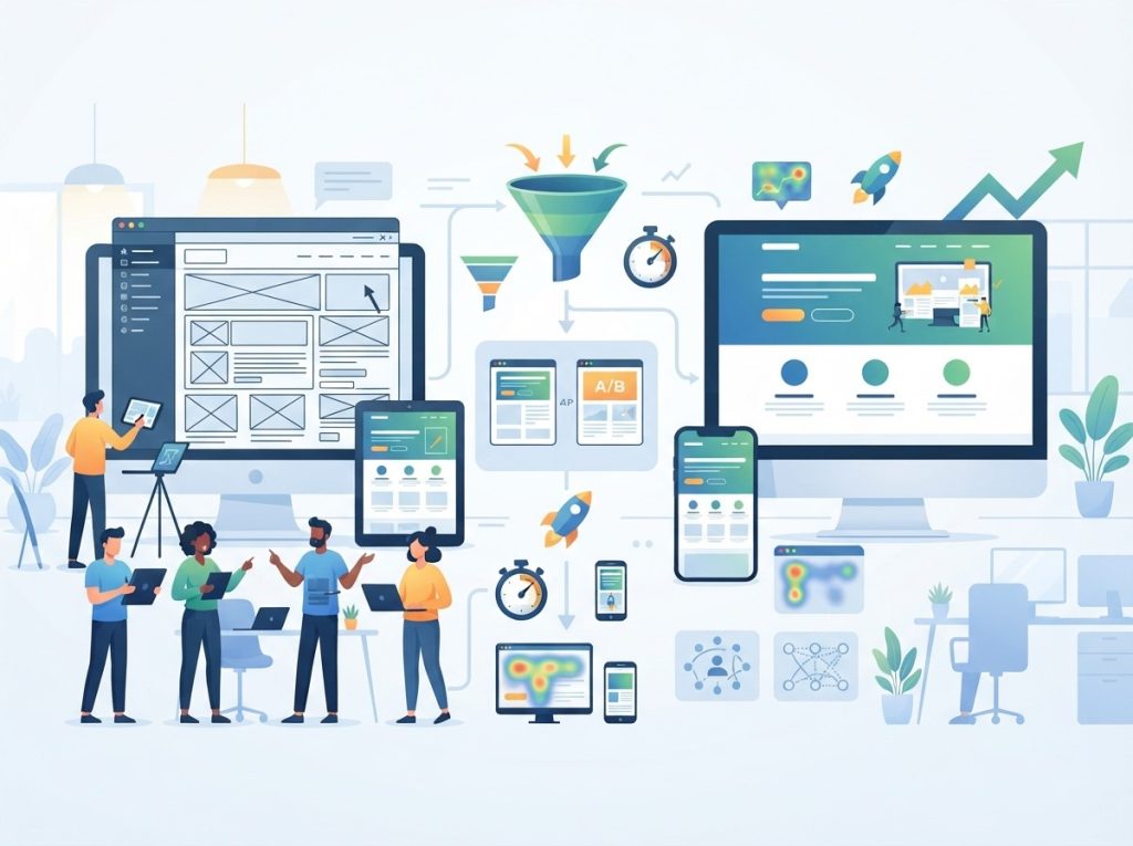 Removing individual conversion barriers is useful, but long-term results require a consistent approach to website optimization. Businesses should consider speed, usability, content, trust, design, mobile performance, and customer expectations as interconnected parts of the conversion experience.
Regular audits can identify new problems as products, audiences, technologies, and customer behaviors change. Combining analytics with user feedback and structured Website experiments creates a practical foundation for continuous improvement. A conversion-focused website should make it easy for visitors to understand the offer, trust the business, navigate the experience, and complete the intended action.
Conclusion
Website Conversion Barriers can appear at almost every stage of the customer journey. Slow loading pages, confusing navigation, unclear CTAs, complicated forms, weak value propositions, poor mobile experiences, and insufficient trust signals can all create friction that prevents visitors from converting.
Businesses can address these problems through Page speed optimization, clearer website structures, simpler forms, stronger content, focused CTAs, and better mobile experiences. Using analytics, user behavior data, and Website experiments can further reveal which improvements deserve attention. Conversion optimization is an ongoing process. By continuously identifying friction and improving the user journey, businesses can create a website that makes desired actions clearer, easier, and more accessible.
Frequently Asked Questions
1. What are Website Conversion Barriers?
Website Conversion Barriers are problems that make it difficult for visitors to complete desired actions. They can include slow pages, confusing navigation, complicated forms, weak CTAs, poor mobile experiences, and lack of trust.
2. Why do Website Conversion Barriers matter?
They can prevent existing website traffic from becoming leads, customers, subscribers, or other valuable conversions. Removing unnecessary friction can create a smoother customer journey.
3. How does page speed affect conversion rates?
Slow-loading pages can create frustration and increase the likelihood that visitors leave before interacting with important content. Page speed optimization can help create a faster and more accessible experience.
4. Can Website Conversion Barriers cause cart abandonment?
Yes. Complicated checkout steps, unexpected costs, limited payment options, slow pages, and unclear policies can contribute to users leaving before completing purchases. Simplifying checkout can help reduce cart abandonment.
5. How can businesses identify conversion barriers?
Businesses can use analytics, conversion data, heatmaps, session recordings, user feedback, usability testing, and Website experiments to identify areas where visitors experience friction.
6. What is the role of Website experiments in conversion optimization?
Website experiments allow businesses to compare different versions of website elements and measure how changes affect user behavior. They can help validate optimization ideas using observed data.
7. How can a website reduce form-related barriers?
Businesses can review each form field and remove information that is not necessary for the intended purpose. Clear labels, logical layouts, useful error messages, and simple steps can also improve form usability.
8. Does mobile design affect website conversions?
Yes. Difficult navigation, small buttons, unreadable text, slow loading, and poorly designed forms can make mobile visitors less likely to complete desired actions.
9. How often should businesses review conversion barriers?
There is no single schedule for every website. Businesses can conduct regular reviews and additional audits after major redesigns, campaigns, product changes, or significant shifts in user behavior.
10. What is the first step in removing Website Conversion Barriers?
The first step is identifying where users experience the most friction. Reviewing analytics, user behavior, page performance, and conversion data can help businesses determine which problems deserve investigation first.