

Your website is pulling traffic. People are landing on your pages, scrolling through your content, clicking around. But when they hit your form? They leave. This is one of the most common—and most costly—conversion problems businesses face. Forms are the final bridge between interest and action, whether that’s a newsletter signup, a product purchase, a quote request, or a demo booking. When that bridge has too many gaps, potential customers fall through.
Form optimization is the process of refining your web forms to reduce friction, increase completions, and ultimately drive more conversions. It combines smart design, behavioral analytics, and continuous testing to turn a passive page element into an active revenue driver. Done well, it can significantly lift your conversion rates without increasing a single dollar of ad spend.
This guide breaks down the most effective form optimization strategies, from structural changes and UX improvements to conversion tracking and data-driven testing. Whether your forms are barely converting or already performing decently, there’s almost always room to do better.
Why Do Website Forms Underperform?
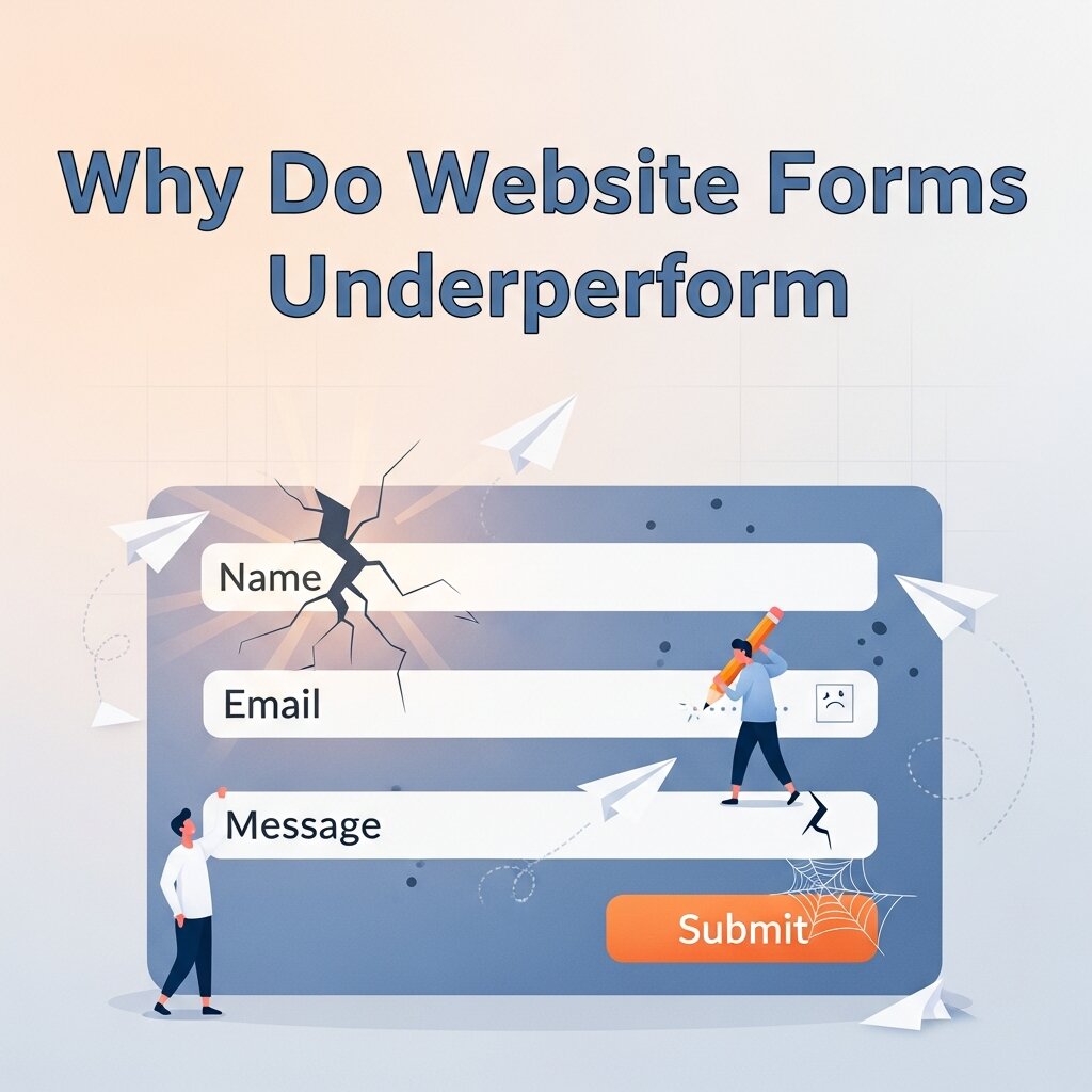 Before fixing what’s broken, it helps to understand why forms fail in the first place. Most underperforming forms share a few common traits: they ask for too much information, they’re poorly laid out on mobile, or they create unnecessary anxiety around data privacy. Sometimes the issue is subtler—confusing labels, ambiguous error messages, or a submit button that doesn’t communicate what happens next.
Behavioral analytics tools like Hotjar or Microsoft Clarity reveal exactly where users drop off. You might find that 80% of users abandon at the phone number field, or that mobile users struggle with a multi-column layout. This kind of insight is far more valuable than gut instinct, and it gives your optimization efforts a clear starting point. The bottom line: forms fail when they create more effort than the user is willing to give. Your job is to reduce that effort at every step.
How Many Fields Should a Web Form Have?
The relationship between form length and conversion rate is well-documented. Generally speaking, fewer fields mean higher completions—but that’s not the full picture. A landmark study by HubSpot found that forms with three fields convert at a higher rate than those with more. However, removing fields indiscriminately can hurt lead quality. A business that needs qualified leads might prefer a slightly longer form that filters out low-intent visitors.
The key is intentionality. For every field you include, ask: do we actually use this data, and does it justify the friction it adds? Fields like “company size,” “job title,” or “how did you hear about us?” can often be gathered later—after the user has converted. Start with the minimum viable ask, and layer in additional data collection post-conversion through onboarding flows or follow-up emails.
For high-stakes forms (like mortgage applications or insurance quotes), progressive disclosure can help. This means breaking a long form into multiple steps, showing one section at a time. Users who begin a multi-step form are more likely to finish it, partly because of the sunk cost effect—once they’ve started, they want to complete it.
What Are the Most Effective Form Design Practices?
Design isn’t just about aesthetics. In the context of form optimization, design decisions directly impact whether users complete your form or abandon it.
Use a Single-Column Layout
Research from CXL Institute shows that single-column forms are completed faster and more accurately than multi-column layouts. Multi-column forms create visual ambiguity—users can lose their place or skip fields unintentionally. Single-column layouts create a clear, linear path from top to bottom, which reduces cognitive load and speeds up completion.
Place Labels Above Fields, Not Inside Them
Placeholder text inside form fields might look clean, but it disappears the moment a user starts typing. This means they can no longer see what the field was asking for—leading to errors and frustration. Top-aligned labels keep instructions visible throughout the entire input process and are far more accessible for screen readers.
Make Error Messages Specific and Helpful
Generic error messages like “invalid input” are one of the fastest ways to lose a user. Specific messages—like “Please enter a valid email address”—tell users exactly what went wrong and how to fix it. Inline validation, which flags errors in real time rather than after the user hits submit, is even better. It catches mistakes early, before they become a reason to abandon the form.
Optimize for Mobile
Mobile users now account for more than half of global web traffic, according to Statista. Yet many forms are still designed primarily for desktop. On mobile, small tap targets, tightly spaced fields, and horizontal layouts create significant friction. Use large input fields, appropriate keyboard types (e.g., numeric keyboard for phone fields), and test your forms on multiple screen sizes before launch.
How Do You Use Behavioral Analytics to Improve Form Performance?
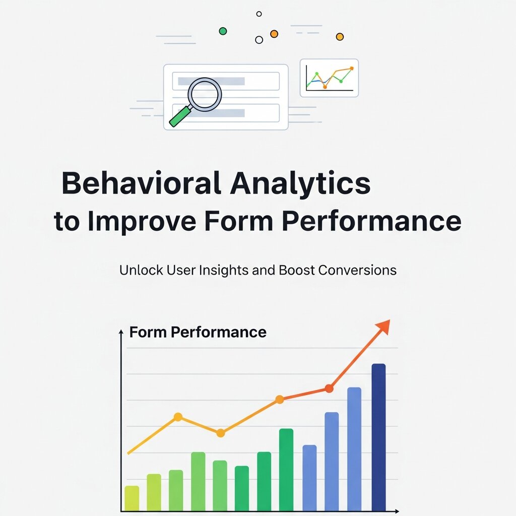 Behavioral analytics is where form optimization gets data-driven. Rather than guessing why users drop off, tools like Hotjar, FullStory, and Google Analytics 4 show you exactly what’s happening—and where.
Heatmaps reveal which fields users click most, hesitate on, or skip entirely. A field that users repeatedly return to suggests confusion—either the label is unclear or the information being requested is unexpected.
Session recordings let you watch real user interactions with your form. This is often the fastest way to spot usability issues that wouldn’t show up in aggregate data. You might notice users repeatedly clicking a non-clickable element, or struggling to scroll to a hidden submit button on mobile.
Funnel analysis in tools like GA4 shows you the drop-off rate at each step of a multi-step form. If 70% of users complete step one but only 30% make it to step three, that’s a clear signal that step two needs attention.
Combining these behavioral analytics insights with conversion tracking data gives you a complete picture—not just where users drop off, but why.
What Role Does Conversion Tracking Play in Form Optimization?
Conversion tracking is the foundation of any meaningful form optimization effort. Without it, you’re optimizing blindly. At its most basic, conversion tracking means recording a “goal completion” every time a user successfully submits your form. This data feeds into platforms like Google Ads, Meta Ads, and your CRM, allowing you to measure cost-per-conversion, attribute revenue to specific campaigns, and identify which traffic sources bring in the highest-quality leads.
But conversion tracking goes deeper than just counting submissions. Setting up micro-conversion tracking—recording events like “form field focused,” “form partially completed,” or “form error triggered”—gives you a granular view of the form journey. This level of detail helps pinpoint exactly where optimization efforts will have the biggest impact.
For e-commerce, conversion tracking should also connect form completions to downstream revenue. A checkout form that converts at 60% but generates low average order values might be less valuable than one converting at 40% with higher-ticket completions. Revenue-based conversion tracking brings this nuance to light.
What A/B Testing Strategies Work Best for Form Optimization?
A/B testing is the most reliable method for validating form changes before rolling them out permanently. Rather than assuming a new design or copy will perform better, you split your traffic—sending half to the original form and half to the variant—and let the data decide.
The most impactful variables to test include:
- Number of form fields: Reducing fields by even one can produce meaningful conversion lifts.
- CTA button copy: “Get My Free Quote” consistently outperforms generic options like “Submit” or “Send.” The more specific the copy, the more compelling it feels.
- Form placement: A form embedded above the fold on a landing page often outperforms a pop-up or a below-the-fold version.
- Social proof near the form: Adding a testimonial, trust badge, or privacy assurance statement directly beside your form can reduce anxiety and increase completions.
- Progress indicators on multi-step forms: Showing users how far along they are (“Step 2 of 3”) reduces abandonment by setting expectations.
When running A/B tests, give each experiment enough time to reach statistical significance. Calling a test early—before enough users have seen each variant—leads to unreliable conclusions. Tools like Google Optimize (or its successors), VWO, and Optimizely can manage the testing process and handle statistical analysis automatically.
How Does Form Copy Influence Conversion Rates?
 Most marketers focus on form structure and overlook the copy itself. That’s a missed opportunity. Every word on your form—from the headline above it to the microcopy beneath each field—shapes how users perceive the ask. A form that says “Start your free trial” feels very different from one that says “Create an account.” The first communicates value; the second communicates effort.
Field labels also carry weight. “Full Name” is fine. “What should we call you?” can feel warmer, depending on your brand. Privacy microcopy—a small line beneath the email field like “We’ll never share your details with third parties”—has been shown to increase email field completion rates, particularly in high-trust-sensitivity markets. The submit button deserves special attention. First-person phrasing often outperforms third-person alternatives. “Send me the guide” tends to convert better than “Download guide” because it reinforces the benefit from the user’s perspective.
Frequently Asked Questions About Form Optimization
What is form optimization?
Form optimization is the process of improving website forms to reduce friction, increase completion rates, and generate more conversions. It involves optimizing form length, layout, fields, copy, mobile usability, error messages, and calls to action.
How many fields should a website form have?
There is no universal number, but fewer fields generally reduce friction and can increase completions. Businesses should only request information they genuinely need. Additional details can often be collected later through onboarding or follow-up communication.
Does a shorter form always convert better?
Not necessarily. Shorter forms can increase completion rates, but longer forms may help businesses qualify leads more effectively. The ideal form length depends on the conversion goal, audience, and information required to provide value.
Why is a single-column form layout recommended?
Single-column layouts create a clear visual path and reduce cognitive load. Users can move through fields from top to bottom without having to determine which field comes next, making forms easier and faster to complete.
How can mobile optimization improve form conversions?
Mobile-friendly forms use appropriately sized input fields, sufficient spacing, suitable keyboard types, and responsive layouts. Testing forms across different screen sizes helps identify usability problems that can cause mobile visitors to abandon the form.
How do behavioral analytics help with form optimization?
Behavioral analytics tools can reveal where and why users abandon forms. Heatmaps show interaction patterns, session recordings reveal usability problems, and funnel analysis identifies the specific steps where users drop off.
What should a good form error message include?
A good error message should clearly explain what went wrong and tell users how to correct it. For example, instead of saying “invalid input,” a form can explain that a valid email address is required. Inline validation can also identify mistakes before submission.
What form elements should be A/B tested?
Important elements to test include the number of fields, CTA button copy, form placement, social proof, privacy messaging, and progress indicators on multi-step forms. A/B testing helps determine which variation produces better results based on actual user behavior.
How does form copy affect conversions?
Form copy influences how users perceive the effort and value associated with completing the form. Benefit-focused headlines, clear field labels, reassuring privacy statements, and specific CTA text can make the action feel more valuable and trustworthy.
How often should website forms be tested?
Form optimization should be treated as an ongoing process rather than a one-time task. Businesses can regularly monitor conversion data, run A/B tests, and revisit forms when traffic sources, products, or user behavior change significantly.
Build a Culture of Continuous Form Testing
Form optimization doesn’t have a finish line. User behavior changes. Traffic sources shift. A form that converts well today may plateau or decline as your audience evolves. The most successful teams treat form optimization as an ongoing practice—not a one-time project. They monitor conversion tracking dashboards regularly, run at least one A/B test per month, and revisit form design every time a significant traffic or product change occurs.
Start with the form that drives your most important conversion. Audit it using behavioral analytics, identify your highest-friction field, and run a test. A single well-executed experiment can uncover insights that lift conversions by double digits—and those gains compound over time. Small changes to a form most people overlook can become one of the highest-ROI improvements you make this quarter. The data is already there. The tools exist. The only thing left is to start testing.