
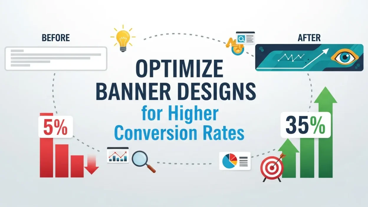
Learn how to optimize banner designs to boost engagement and conversions. This guide covers bold visuals, compelling headlines, clear CTAs, mobile optimization, urgency, and brand alignment, providing actionable strategies to create high-performing banners that drive clicks and business growth.
Whether you’re scrolling through a website or browsing your favorite app, banners are everywhere—moving visuals designed to grab attention. But not all banners are created equally. Some act as “stop signs,” immediately catching the viewer’s eye, while others are so subtle they go completely unnoticed.
If you’re reading this, you’re likely looking to make your banners fall into the first category—banners that not only attract attention but also convert viewers into clicks, leads, or customers. By learning how to optimize banner designs, you can ensure your ads stand out in crowded digital spaces and drive meaningful engagement for your campaigns.
In this guide, we’ll break down the key factors, strategies, and design principles behind high-performing banners. From visuals, headlines, and CTAs to mobile optimization, urgency, and brand alignment, you’ll gain actionable insights to create banners that truly convert.
By the time you finish reading, you’ll be familiar with all the essential elements required to optimize banner designs for higher click-through rates, better conversions, and a stronger overall ROI. Start applying these tactics today, and watch your banners perform like never before!
Why Banner Designs Matter for Conversions
A well-designed banner is like the storefront of your digital presence. In just a few seconds, your audience decides whether to engage with your message or scroll past. Poorly executed banners can cost you clicks, conversions, and credibility, making it harder to achieve your marketing goals.
On the other hand, an optimized banner can transform your campaign. When you optimize banner designs, you’re not just improving aesthetics—you’re strategically enhancing every element to drive higher click-through rates (CTR), increase conversions, and boost overall ROI.
Here’s why optimizing banner designs is crucial for conversions:
- They communicate your value proposition quickly and effectively.
- They capture attention in a crowded digital landscape.
- They guide users toward specific actions, like clicking a CTA button, signing up for a newsletter, or making a purchase.
- They reinforce brand identity, making users more likely to trust and engage with your offer.
But how do you achieve this level of effectiveness? The answer lies in optimizing banner designs through thoughtful design elements, concise messaging, and audience-focused alignment. By prioritizing these factors, your banners won’t just look good—they’ll perform exceptionally.
Start with a Clear and Compelling Visual
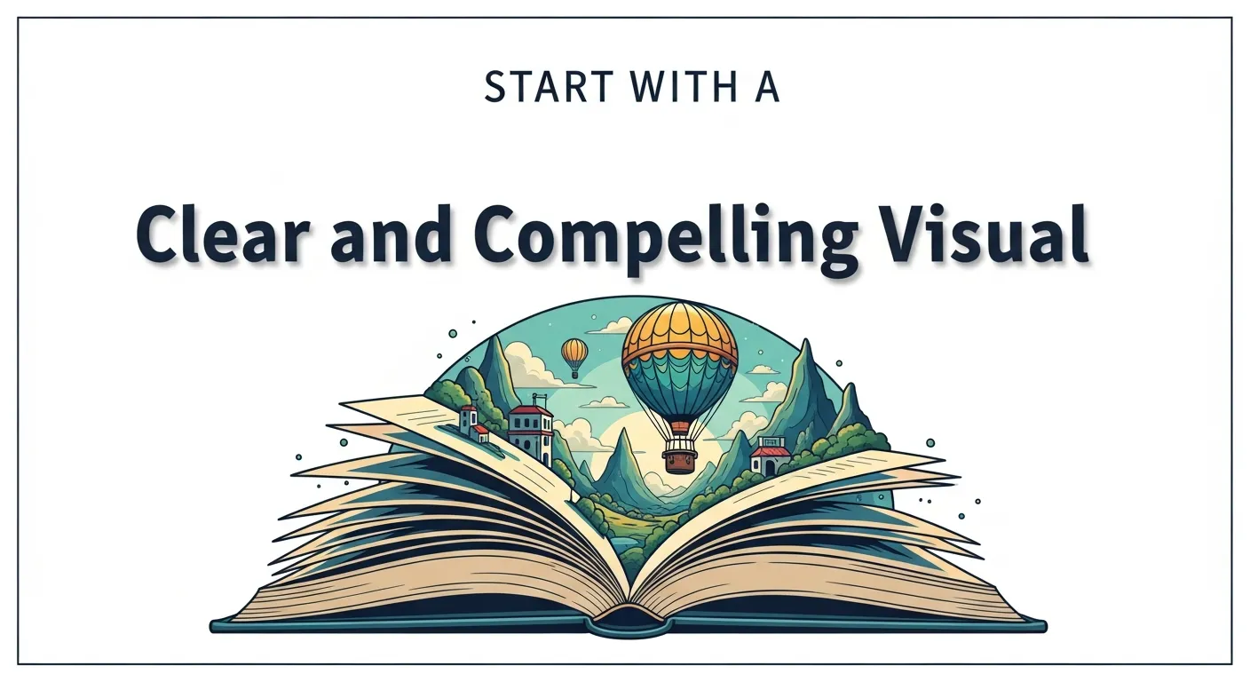
Hook Them with Bold Imagery
Visuals are the first thing users notice when they see your banner. A strong, relevant image grabs attention immediately, setting the stage for engagement and conversions. To optimize banner designs, your visuals must be not only eye-catching but also aligned with your brand and messaging.
Tips for Effective Imagery:
-
High-Quality Photography: Use crisp, professional images that resonate with your audience. Avoid blurry or generic stock photos that fail to connect.
-
Relevant Graphics or Illustrations: Match the style of your visuals to your product or service. For instance:
-
A fitness product benefits from energetic, action-filled imagery of people working out.
-
A tech product gains credibility from sleek, futuristic graphics that convey innovation and sophistication.
-
-
Emotionally Engaging: Images that evoke emotion—like excitement, curiosity, or trust—can significantly increase click-through rates.
-
Audience Alignment: Always consider your target demographic. Visuals should reflect the lifestyle, aspirations, and interests of the people you want to reach.
Use Contrast Wisely
Contrast is a powerful tool in banner design. Proper use of color and typography ensures that your message and CTA are immediately readable, even at a glance. By strategically pairing background, text, and CTA colors, your banners can stand out without overwhelming the viewer.
Practical Contrast Tips:
- Pair a dark background with light, bold text for maximum readability.
- Highlight CTAs with a color that pops against the banner background.
- Use contrast not just in color, but in size and weight—make your headline and CTA prominent, while secondary text is subtle.
- Maintain consistency with your brand palette to reinforce recognition.
Why This Matters
When you optimize banner designs with bold visuals and strong contrast, you ensure that:
- Users immediately notice your banner in a crowded digital space.
- Your key message and CTA are clear and actionable.
- Your brand communicates professionalism and credibility at first glance.
Pro Tip: Always test multiple visuals and contrast combinations. What works for one audience segment may not work for another. A/B testing helps you discover which imagery drives the highest engagement and conversions.
Prioritize Simplicity in Design
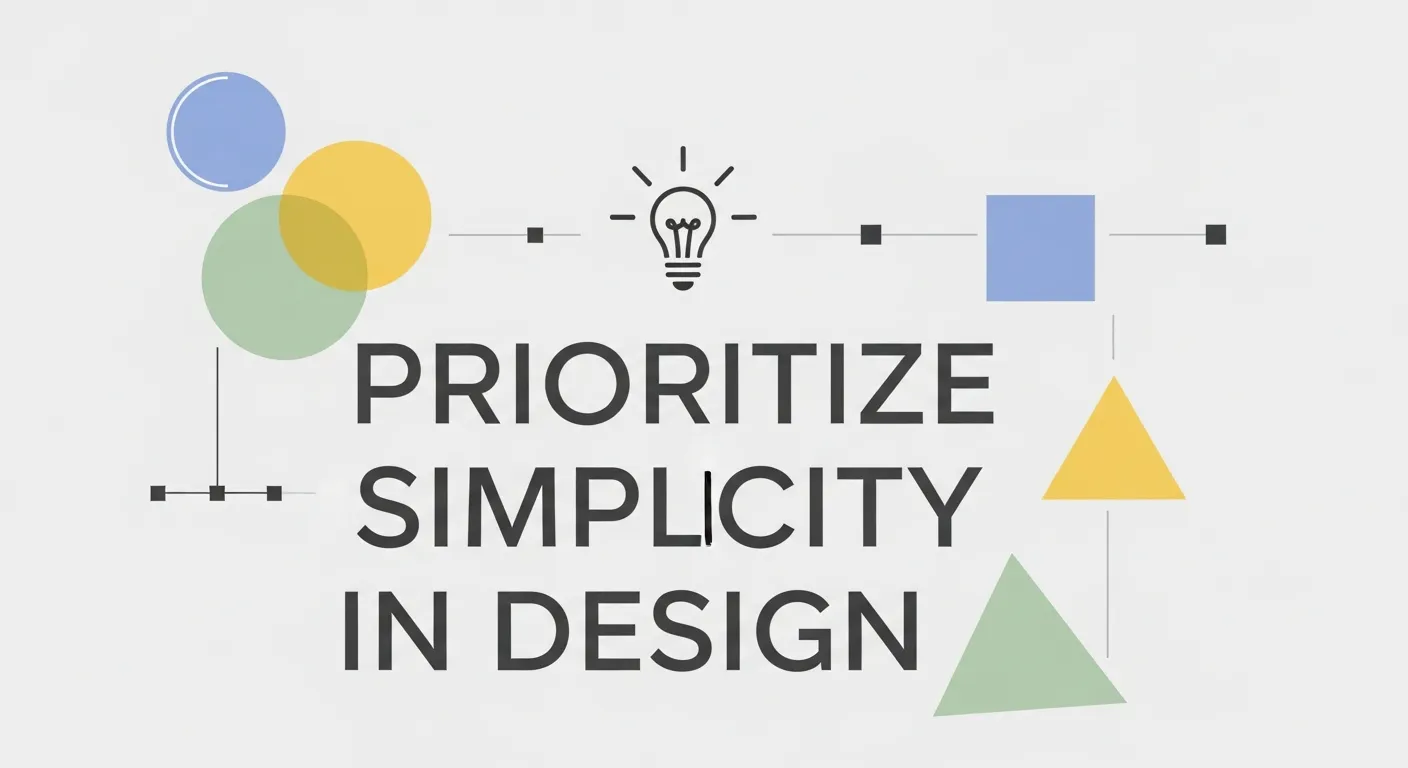
Simplicity is one of the most powerful principles when you aim to optimize banner designs for higher conversions. Overloading a banner with too much text, too many colors, or multiple competing visuals can overwhelm viewers. It’s like trying to speak two different languages at once—your message gets lost, and engagement drops.
A successful banner focuses on one central idea. By keeping your message concise and your visuals clean, users can quickly understand the value you’re offering and take action. Minimalist designs not only look aesthetically pleasing but also guide the viewer’s attention to the most important elements, such as your headline and CTA.
Tips for Achieving Simplicity:
- Focus on a single message or offer per banner.
- Limit text to one short headline or tagline that communicates your value proposition.
- Use a maximum of two to three complementary colors to maintain visual harmony.
- Choose one strong visual that supports your message without cluttering the design.
Take inspiration from brands like Apple. Their banners are renowned for being minimal yet impactful—one bold visual, a short headline, and a clear CTA often suffice to drive engagement.
Use Negative Space Effectively
Negative space, also called white space, is more than just empty space—it’s a design tool that guides the viewer’s eye. Proper use of negative space ensures your banner doesn’t feel crowded and helps important elements, like your CTA, stand out.
How to Use Negative Space:
- Surround your CTA with space to make it the natural focal point.
- Use spacing around text to improve readability, especially on smaller screens.
- Let your visuals breathe—avoid squeezing multiple images into a tight layout.
- Apply consistent margins to maintain a clean, professional appearance.
Why Simplicity Works
When you optimize banner designs with simplicity and thoughtful negative space:
- Users instantly understand your message without confusion.
- Engagement and click-through rates improve because attention is directed to the CTA.
- The banner looks professional, builds trust, and enhances your brand’s credibility.
Pro Tip: Minimalism doesn’t mean boring. Strategic use of contrast, typography, and color can make a simple design highly compelling while keeping the overall layout clean. Combine simplicity with bold elements to maximize both clarity and conversion potential.
Craft Attention-Grabbing Headlines
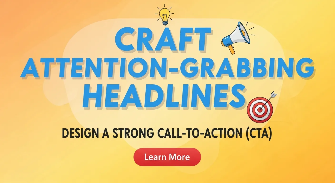
Your headline is often the make-or-break element of a banner. Even the most visually stunning designs can fall flat if the headline doesn’t capture attention or communicate value quickly. When you aim to optimize banner designs, creating compelling, concise, and actionable headlines is key to driving clicks and conversions.
Be Concise but Impactful
The best banner headlines are short, snappy, and to the point. Users often spend just a few seconds deciding whether to engage with your banner, so your message must be instantly clear. A single line that delivers your value proposition effectively can make all the difference.
Examples of Effective Headlines:
- “Save 50% on Your First Order” – communicates immediate benefit.
- “Transform Your Space with Smart Lighting” highlights the result.
- “Experience the Future of Fitness Equipment” – sparks curiosity and excitement.
Tips for Crafting Concise Headlines:
- Use no more than 5–8 words when possible.
- Focus on one main benefit or outcome.
- Avoid jargon or overly technical language that might confuse the audience.
Use Action-Oriented Language
Action verbs in headlines inspire urgency and encourage users to take the next step. When you optimize banner designs, pairing a strong headline with an action-oriented CTA can significantly boost engagement.
Action-Oriented Phrases to Try:
- “Shop Now” – encourages immediate purchase.
- “Try It Free” – lowers risk and invites experimentation.
- “Join Today” – creates a sense of immediacy and participation.
- “Claim Your Offer” – emphasizes exclusivity and urgency.
Test and Refine Headlines
No headline is perfect on the first try. Use A/B testing to see which phrasing, tone, or style resonates best with your target audience. Testing helps you:
- Identify the most persuasive words or benefits.
- Determine which style aligns with your brand voice.
- Optimize click-through rates and overall conversions.
Why Headlines Matter
When you focus on crafting headlines that are clear, concise, and action-oriented, you ensure your banner:
- Captures attention quickly in a crowded digital space.
- Communicates value immediately, reducing hesitation.
- Guides users naturally toward your CTA, boosting conversions.
Pro Tip: Headlines should always complement your visuals. A bold image plus a strong, action-driven headline forms a cohesive message that is far more likely to engage users than either element alone.
Design a Strong Call-to-Action (CTA)
Your Call-to-Action (CTA) is the ultimate goal of your banner. It’s the element that guides users from passive viewers to active participants—whether that’s making a purchase, signing up for a newsletter, or downloading a resource. To optimize banner designs effectively, the CTA must be prominent, compelling, and crystal clear.
Make Your CTA Stand Out
A CTA should immediately capture attention and guide the user toward the next step. Use visual techniques that make your CTA pop without overwhelming the rest of your design:
- Contrasting Colors: Choose a button color that stands out against the background while still fitting your overall color palette.
- Strategic Placement: Position your CTA where the eye naturally lands, often near the center or bottom right of the banner.
- Graphical Enhancements: Incorporate subtle visual cues like arrows, lines, or shapes pointing toward the CTA to intuitively draw attention.
- Sufficient White Space: Surround your CTA with enough negative space so it doesn’t compete with other elements.
Be Clear and Specific
Generic CTAs like “Click Here” or “Submit” don’t communicate value and often get ignored. A specific, benefit-focused CTA helps users understand exactly what action they’re taking and what they’ll gain:
Examples of Effective CTAs:
- “Get My Free E-Book” – highlights an immediate reward.
- “Start Your Free Trial” – reduces friction and encourages engagement.
- “Find Out More” – sparks curiosity while guiding users to learn further.
- “Claim Your Discount Today” – adds urgency and relevance.
Tips for Crafting Strong CTAs:
- Use action-oriented verbs to inspire movement: “Get,” “Start,” “Claim,” “Discover.”
- Communicate a clear benefit so users feel motivated to click.
- Keep it short and readable, ideally 2–5 words.
Why a Strong CTA Matters
When you optimize banner designs with a powerful, specific CTA:
- Users know exactly what to do next, reducing hesitation.
- Click-through rates increase because the CTA is visually and contextually compelling.
- Conversions improve as the user experience feels intuitive and rewarding.
Pro Tip: Test multiple CTA variations using A/B testing to identify which wording, color, or placement performs best with your audience. Even small tweaks—like changing “Get Started” to “Start Your Free Trial”—can lead to significant improvements in engagement and conversion.
Optimize for Mobile Devices
With over 50% of web traffic coming from mobile devices, designing banners that look great and function seamlessly on smaller screens is no longer optional—it’s essential. To optimize banner designs for mobile, every element of your banner must be carefully adapted to ensure clarity, usability, and engagement across all device types.
Use Responsive Design
Responsive banners automatically adjust their layout, size, and visual hierarchy based on the screen they are displayed on. This ensures that your banner looks professional and your message remains clear, whether viewed on a smartphone, tablet, or desktop.
Tips for Responsive Banner Design:
- Test Across Devices: Check how your banners appear on different smartphones, tablets, and desktop monitors to ensure the visuals, text, and CTA remain legible.
- Prioritize Key Elements: On smaller screens, focus on your headline, core visual, and CTA. Avoid clutter that may be acceptable on a desktop but overwhelms mobile users.
- Flexible Layouts: Use scalable images and text so that nothing is cut off or too small to read.
Keep It Touch-Friendly
Mobile users interact differently from desktop users. To optimize banner designs for touch, clickable elements need to be easy to tap:
- Large Buttons: Make your CTA buttons big enough for fingers to tap without frustration.
- Adequate Spacing: Leave enough space between buttons and other interactive elements to prevent accidental clicks.
- Intuitive Placement: Place CTAs where thumbs naturally reach—usually near the center or lower portion of the screen.
Why Mobile Optimization Matters
When banners are optimized for mobile devices:
- Users can engage easily without frustration, reducing bounce rates.
- Your key message and CTA remain clear even on small screens.
- Conversion rates improve as mobile users can interact effortlessly.
Pro Tip: Mobile-first design should be part of your standard workflow when you optimize banner designs. Even if most of your traffic currently comes from desktop users, mobile traffic is growing rapidly, and ensuring a seamless experience across all devices is critical for long-term performance.
Add a Sense of Urgency and Align with Your Brand
To truly optimize banner designs for higher conversions, it’s not enough to just look good—you need to create banners that motivate immediate action while remaining consistent with your brand identity. Two of the most powerful strategies to achieve this are creating urgency and maintaining brand alignment.
Create a Sense of Urgency
Scarcity and urgency are psychological triggers that push users to act now rather than later. When used effectively in banners, they can significantly increase click-through and conversion rates.
Tactics to Build Urgency:
- Time-Limited Offers: Use phrases like “Limited-Time Offer” or “Only 3 Days Left” to encourage immediate action.
- Countdown Timers: Dynamic elements like countdown clocks visually show the time remaining on a promotion, adding pressure and excitement.
- Exclusive Deals: Highlight exclusive promotions such as “Members Only” or “First 100 Customers” to make users feel they might miss out.
These techniques not only increase engagement but also make your banners more compelling and action-oriented.
Leverage A/B Testing
Even the most polished banners benefit from continuous testing. A/B testing allows you to determine which designs, headlines, CTAs, or color schemes resonate best with your audience.
A/B Testing Tips:
- Test one variable at a time—headline, CTA wording, or visual—to clearly identify what drives performance.
- Use platforms like Google Ads and Facebook Ads, which offer built-in A/B testing tools for easy experimentation.
- Continuously analyze metrics like CTR, bounce rate, and conversions to refine your banners.
By combining urgency with data-driven testing, you can optimize banner designs that consistently convert and adapt over time.
Align Your Banner with Your Brand
Your banner is a direct extension of your brand identity. Consistency in visuals, colors, and messaging ensures your audience recognizes and trusts your brand. When your banner reflects your brand’s tone, users are more comfortable clicking and engaging.
Brand Alignment Tips:
- Incorporate your logo and brand colors prominently.
- Use messaging that matches your overall brand voice.
- Ensure visual elements harmonize with other marketing channels for consistency.
Consistency with Landing Pages
Even the most compelling banner can fail if the experience on the landing page doesn’t match. Ensure your banners lead to landing pages that mirror the design and messaging of your ads. A consistent journey from banner to page:
- Reinforces user trust.
- Reduces confusion and bounce rates.
- Increases the likelihood of conversion.
When you optimize banner designs, always think about the end-to-end experience. From visual appeal and urgency to brand alignment and landing page consistency, every element should work together to guide users toward taking the desired action.
Use Data-Driven Insights to Inform Your Banner Strategy

In today’s digital marketing landscape, intuition alone is no longer enough. Successful banners are crafted from real insights derived from data. By analyzing how users interact with your banners — from impressions to clicks to conversions — you can continuously refine visuals, messaging, and placement. This approach ensures every design decision is rooted in measurable results rather than guesswork.
Key Metrics to Track
- Click-Through Rates (CTR): Identify which banners are grabbing attention and which are being ignored.
- Conversion Rates: Determine whether clicks are translating into meaningful actions, like purchases or sign-ups.
- Heatmaps & User Behavior: Understand where viewers’ eyes naturally go on your banner and which elements draw the most attention.
- Time of Day / Frequency: Some audiences respond better at certain times, making timing a crucial factor.
- Device Performance: Compare engagement on mobile versus desktop to ensure your design works across all platforms.
Data becomes even more powerful when combined with strategic media buying. Understanding the lifecycle value of customers from different ad sources can guide how you tailor banner designs and where to allocate budget most effectively rom clicks to conversions how media buying services drive growth.
Actionable Insights from Data
- Refine Visuals: Swap images or graphics that underperform with alternatives tested through data.
- Test Messaging: Headlines or CTAs that don’t convert can be rewritten based on audience behavior.
- Optimize Placement: Data can reveal which positions or platforms yield the highest engagement.
- Allocate Budget Smartly: Invest more in banners and campaigns showing proven ROI.
Data Action Checklist
| Metric | What It Tells You | How to Use It |
|---|---|---|
| CTR | Attention & relevance | Improve visuals/headlines |
| Bounce Rate | Landing page mismatch | Align banner + page design |
| Cost per Acquisition (CPA) | Campaign efficiency | Reallocate budget to winning banners |
| Return on Ad Spend (ROAS) | Financial success | Scale best-performing creatives |
| Engagement by Device | Mobile vs Desktop preference | Optimize responsive design |
By continuously monitoring these metrics, you create a feedback loop that allows your banners to evolve and become increasingly effective over time.
Sync Banner Designs with Your Email Marketing
Banners don’t exist in a vacuum — they should work in harmony with other channels, particularly email marketing. A synchronized approach ensures that users experience a consistent message across touchpoints, which can significantly improve conversions. When a user sees a banner and then receives a related email with a matching message, they are far more likely to engage.
Why Cross-Channel Consistency Matters
- Brand Recognition: Using consistent colors, fonts, and imagery across banners and emails strengthens your brand identity.
- Message Reinforcement: Repeating a value proposition increases user trust and the likelihood of conversion.
- Enhanced Recall: Users are more likely to remember your offer when the design and copy are aligned.
Banners can also play a supporting role in email campaigns. For example, targeting users who opened your email but didn’t convert with a banner ad that mirrors the same message can improve engagement and increase ROI b2b email marketing open rates and conversions).
Practical Tips for Email + Banner Integration
- Match headline tone between email subject lines and banner text.
- Use similar imagery and color schemes to create a cohesive visual journey.
- Highlight the same key benefits or promotions to reinforce your message.
- Use behavioral targeting to serve banners based on email interactions, such as clicks or opens.
Email + Banner Strategy
| Strategy Element | Banner | Expected Impact | |
|---|---|---|---|
| Headline | Personalized offer | Matching headline/value | Improved recognition & trust |
| Imagery | Product showcase | Reinforced brand visuals | Emotional appeal & higher engagement |
| CTA | Actionable link | Bold, attention-grabbing button | Increased clicks & conversions |
| Timing | Email send schedule | Banner display schedule | Higher conversion alignment |
By integrating banners with email campaigns, your brand creates a seamless user journey, guiding prospects toward the desired action while reinforcing your core message at every touchpoint.
Use AI and Automation to Personalize Banners at Scale
Artificial intelligence is transforming how banners are designed, delivered, and optimized. Personalization is no longer a luxury — it’s an expectation. AI-powered tools allow marketers to deliver dynamic, tailored banners based on user behavior, demographics, and intent, which drives significantly higher conversions.
How AI Enhances Banner Effectiveness
- Dynamic Creative Optimization (DCO): Automatically changes visuals, copy, or CTAs based on the viewer’s preferences and previous interactions.
- Predictive Audiences: AI predicts which users are most likely to engage or convert, enabling better targeting.
- Automated Testing: Machine learning identifies high-performing banner variations faster than manual testing.
- Behavioral Personalization: Users see banners that reflect their browsing history, purchase intent, or engagement patterns.
For eCommerce brands, AI can directly increase sales and conversion rates by serving personalized experiences that feel relevant and timely to each shopper ai chatbots ecommerce conversions).
Advantages of AI-Powered Banner Campaigns
- Tailored content increases relevance and engagement.
- Automated adjustments reduce manual workload for designers and marketers.
- Faster identification of top-performing banners through real-time analytics.
- Optimized ad spend with smarter targeting and personalized delivery.
AI Implementation Roadmap
| Capability | Description | Benefit |
|---|---|---|
| Real-Time Bidding | Optimizes ad auctions based on user likelihood to convert | Better placement & ROI |
| Machine-Learning Design Scores | Predicts which creative elements will perform best | Faster iteration & experimentation |
| Automated Personalization | Dynamically adapts visuals and copy per user | Higher CTR & conversion rates |
| Predictive Targeting | Identifies high-value audiences | Focuses marketing efforts on likely converters |
By incorporating AI and automation, banners become intelligent, adaptive tools that not only attract attention but also respond to user behavior — creating a personalized experience that maximizes conversions.
Achieve Higher Conversions with Better Banner Design
Creating banners that truly convert traffic isn’t just about putting together some flashy visuals—it’s a blend of art, strategy, and skill. To see measurable results, every element of your banner must be carefully crafted with your audience and objectives in mind. By learning how to optimize banner designs, you can turn casual visitors into engaged users, leads, and paying customers.
Why Optimized Banner Designs Make a Difference
- First Impressions Matter: A well-designed banner immediately communicates your brand’s value proposition. Visitors decide in seconds whether your offer is worth their attention.
- Boost Click-Through Rates (CTR): Bold visuals, clear messaging, and intuitive CTAs encourage more users to click on your banner rather than scroll past it.
- Enhance Brand Perception: Optimized designs signal professionalism and credibility, building trust with your audience and improving overall engagement.
Core Elements of High-Converting Banners
- Bold, Relevant Visuals: Your images should grab attention instantly while remaining aligned with your brand and message. High-quality photography or graphics tailored to your audience creates an emotional connection.
- Clear and Compelling CTAs: Every banner should have a specific call-to-action that tells users exactly what to do next. Action-oriented language like “Get Started Today” or “Claim Your Free Trial” works best.
- Simplicity and Focus: Avoid clutter. Each banner should focus on a single message or offer, with plenty of negative space to draw attention to the most important elements.
- Consistency Across Campaigns: Your banner should reflect the same visual style and messaging as your other marketing channels, including emails, landing pages, and social ads, ensuring a seamless user journey.
Steps to Optimize Banner Designs
- Test Variations: Use A/B testing to compare headlines, visuals, CTAs, and color schemes. This identifies what resonates most with your audience.
- Leverage Audience Insights: Analyze demographic and behavioral data to serve banners that are relevant to the right users at the right time.
- Optimize for Mobile: With the majority of traffic coming from mobile devices, ensure your banners are responsive and touch-friendly.
- Create a Sense of Urgency: Including phrases like “Limited-Time Offer” or dynamic countdown timers encourages immediate action.
Example Checklist for High-Converting Banners
| Element | Optimization Tip | Impact |
|---|---|---|
| Visual | Use bold, high-quality images relevant to your audience | Grab attention immediately |
| Headline | Keep it concise, action-driven, and benefit-focused | Improves clarity & engagement |
| CTA | Make it clear, specific, and visually prominent | Increases conversions |
| Layout | Focus on a single message and use negative space effectively | Enhances readability & aesthetic appeal |
| Mobile Optimization | Ensure design adapts to different screen sizes | Maximizes reach & usability |
Making banners that convert traffic is part science, part art, but by following these principles, you can consistently create campaigns that perform. Start using this approach today to see measurable improvements in CTR and conversions. Remember, optimizing banner designs isn’t just about immediate results—it’s about building long-term brand credibility and trust.
And as a final tip: always stand by the quality work you’ve already done, continuously refine it, and let your banners reflect the best of your brand at every click.
Frequently Asked Questions (FAQ)
1. What does it mean to optimize banner designs?
Optimizing banner designs means creating banners that not only catch attention but also drive measurable conversions. This involves combining bold visuals, clear messaging, compelling CTAs, and mobile-friendly layouts to ensure your banner performs at its highest potential.
2. How do I choose the right visuals for my banners?
Select images or graphics that align with your brand and resonate with your target audience. High-quality, relevant visuals help communicate your value proposition quickly and enhance click-through rates. Avoid generic stock photos that don’t support your message.
3. How important is headline writing for banner conversions?
Your headline is often the first thing users notice, making it critical for engagement. Use short, impactful, and action-oriented language to clearly convey the benefit of your offer. A strong headline can significantly improve CTR when you optimize banner designs.
4. What are best practices for designing an effective CTA?
A CTA should be specific, action-oriented, and visually prominent. Phrases like “Get My Free E-Book” or “Start Your Free Trial” clarify the value and encourage immediate action. Use contrasting colors and sufficient spacing to make the CTA easily clickable, especially on mobile devices.
5. How can I make banners mobile-friendly?
With the majority of traffic coming from mobile, banners must be responsive and touch-friendly. Ensure your visuals scale correctly, CTAs are easy to tap, and the design remains clear on smaller screens. This improves both engagement and conversions.
6. How does urgency affect banner performance?
Incorporating urgency triggers, like “Limited-Time Offer” or countdown timers, creates a psychological push for users to act quickly. Banners with urgency-focused elements often see higher CTR and conversion rates compared to static banners.
7. How can A/B testing help improve banner designs?
A/B testing allows you to compare different designs, headlines, CTAs, and color schemes to see what resonates best with your audience. Continuous testing and refinement help maximize conversions and ROI over time.
8. How do banner designs fit into an overall CRO strategy?
Effective banners are a critical component of Conversion Rate Optimization (CRO). They guide users toward desired actions, helping businesses convert traffic into leads or sales. For those interested in learning more about career opportunities in this space, check out:
Build a career in CRO strategies
9. Can optimized banners increase overall business growth?
Yes! Banners that are well-designed, aligned with your brand, and strategically placed enhance lead generation, sales, and brand awareness. For more advanced business-level strategies, see:
Advanced CRO strategies for business growth
10. What role do banners play in long-term marketing success?
Banners help maintain consistent branding, support cross-channel campaigns, and improve conversions over time. They should complement email marketing, landing pages, and paid ads. To learn more about integrating banners into a holistic business approach, see:
CRO strategies to take your business to the next level