

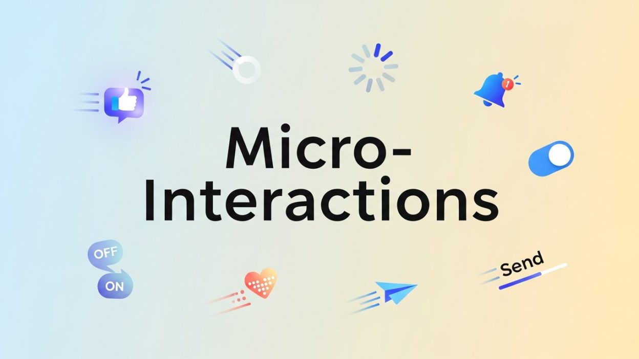
In today’s digital landscape, where every detail competes for user attention, micro-interactions can turn passive visits into meaningful engagements. These brief, focused moments—such as a button ripple, a field highlight, or a small notification—offer immediate feedback and infuse interfaces with a sense of life. Currently, businesses recognize that minor design nuances can have major impacts. This year (2026), brands integrating thoughtful micro-interactions report noticeable uplifts in engagement, reduced abandonment rates, and stronger conversion metrics.
Micro-interactions are not elaborate animations or lengthy tutorials; instead, they are subtle responses tied directly to individual user actions. When a form field glows upon focus or a cart icon gently shakes after adding an item, those small cues reassure visitors, signal progress, and guide next steps. By strategically placing these interactive elements in high-value journeys—whether onboarding new users, completing a purchase, or filling out a sign-up form—websites and apps can create seamless flows that feel intuitive and rewarding.
This comprehensive guide will unpack the foundational concepts behind micro-interactions, explore why they matter for conversion rate optimization, and reveal practical approaches to designing and implementing them effectively. Through real-world examples, key principles, and recommended tools, you’ll gain the insights needed to elevate your interface and nudge visitors toward the actions that drive business growth. Let’s dive into the world of micro-interactions and uncover how these small details can deliver significant ROI.
Understanding Micro-Interactions in Today’s Interfaces
At its essence, a micro-interaction is a targeted moment of feedback that follows a user’s single action. Unlike broad UI animations or multimedia content, micro-interactions address specific tasks: confirming a click, validating an entry, or signaling progression. These interactions often last no more than a few hundred milliseconds but leave a lasting impression on usability and satisfaction.
According to research from Usability.gov, clear, immediate feedback reduces user uncertainty and builds confidence during digital tasks. Similarly, the W3C Web Accessibility Initiative emphasizes the importance of sensory cues that support diverse user needs, including those who rely on assistive technologies. When micro-interactions are designed with accessibility in mind, they not only delight but also ensure that interfaces remain inclusive.
Common examples of micro-interactions include hover states, toggle switches, pull-to-refresh cues, and progress bars. Each serves a functional purpose, such as confirming that an action has registered or illustrating the current state of a process. By integrating these elements thoughtfully, designers can reduce perceived friction, minimize cognitive load, and cultivate a sense of mastery and trust.
Designing micro-interactions demands attention to detail. Elements like timing, easing curves, and trigger logic must align with user expectations. Too slow, and the interaction feels sluggish; too fast, and it goes unnoticed. Maintaining consistency in style and motion also reinforces brand identity. When each interactive element follows a shared set of rules, users quickly learn what to expect, speeding up their decision-making and boosting overall conversion performance.
How Micro-Interactions Drive Engagement and Trust
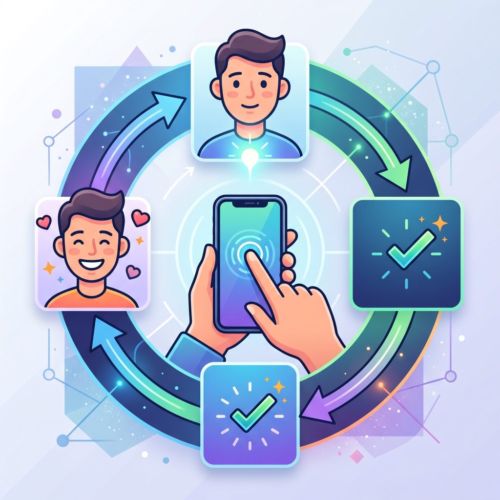
 Micro-interactions wield influence by tapping into psychological triggers that make digital experiences feel more human. When a user perceives that the system is responsive and attentive to their actions, they are more likely to stay engaged and complete desired tasks. This sense of responsiveness directly supports conversion goals by reassuring visitors that their clicks and inputs have meaningful outcomes.
Empirical studies show that well-crafted micro-interactions can increase form completion rates by up to 15% and time-on-page metrics by as much as 20%. These gains stem from reduced user anxiety: every confirmation, highlight, or gentle animation serves as a mini reward that encourages users to proceed. As they progress through a journey—be it checkout, registration, or content exploration—each interaction reinforces momentum and trust.
In addition to bolstering engagement, micro-interactions strengthen brand perception. Consistent, polished feedback loops convey professionalism and attention to detail. When users encounter friction-free interfaces that respond elegantly, they attribute those qualities to the brand itself. Over time, these positive associations can manifest as higher customer satisfaction scores, repeat visits, and referrals.
In today’s competitive marketplace, users expect more than static pages. They anticipate interfaces that feel alive and intuitive. By investing in micro-interactions, organizations signal that they value user experience at every touchpoint. This commitment can differentiate a product or service, driving loyalty and reducing churn in environments where attention spans are shorter and alternatives are plentiful.
Core Principles Guiding Effective Micro-Interactions
While micro-interactions are small by nature, their design requires adherence to fundamental principles to be effective. The first principle is purpose. Every animation or effect must serve a clear goal—whether confirming an action, directing attention, or indicating progress. Random or decorative motions that lack functional intent often distract rather than delight.
Subtlety is equally important. The duration of these interactions should typically range between 150 and 300 milliseconds—fast enough to feel snappy but slow enough for the user to perceive. Easing curves should mimic real-world physics; for example, ease-out for button releases or gentle ease-in for onboarding transitions. This natural motion fosters familiarity and prevents cognitive overload.
Consistency in timing, style, and behavior across elements maintains a cohesive experience. If one button pulses on click while another simply changes color, users may become confused about expected outcomes. Defining shared guidelines for micro-interactions in a design system ensures uniformity across pages and devices.
Responsiveness across platforms is non-negotiable. Animations that run smoothly on desktop might stutter on a budget smartphone. Testing on a range of devices and browsers helps identify performance bottlenecks. Leveraging lightweight libraries—such as Lottie or Framer Motion—can improve frame rates and reduce the risk of janky motion.
Implementing Micro-Interactions: Common Types and Techniques
 To translate principles into practice, consider several micro-interaction categories that have proven effective in boosting conversions. Button feedback is a prime example: when users tap or click a button, a quick ripple or scale-down effect confirms that their input was received. This reassurance prevents repeated clicks and user frustration.
Form field cues are another high-impact technique. Highlighting active fields, animating placeholders, and providing inline validation create a guided form-filling experience. Users receive immediate confirmation when an email address or password meets requirements, reducing the likelihood of errors and abandonment.
Loading indicators keep users engaged during delays. Rather than presenting a blank screen, display progress bars, spinners, or skeleton screens. These cues set expectations about wait times, preventing users from dropping off when servers respond slowly or large assets load.
Scroll-based animations draw attention to key content as it enters the viewport. By animating headers, images, or calls-to-action into view, you can guide the eye toward high-value elements. This tactic ensures that important information doesn’t remain hidden below the fold.
Finally, confirmation messages—such as toasts or inline alerts—celebrate completed actions. Whether a product is added to cart or a newsletter sign-up succeeds, a brief notification with a friendly animation reinforces progress and opens the door to next steps.
Best Practices and Tools to Optimize Micro-Interactions
Rolling out micro-interactions effectively requires a structured approach. Begin by auditing your current interfaces to identify friction points and missing feedback opportunities. Prioritize pages and user flows that drive revenue—checkout pages, sign-up forms, and onboarding screens are usually high-impact targets.
Once you’ve pinpointed areas of focus, design specifications must outline triggers (user events) and expected outcomes (feedback). Document timing, easing curves, and styles within your design system. Tools like Figma and Adobe XD—with motion plugins—enable rapid prototyping and collaboration with stakeholders.
For development, leverage animation libraries that optimize for performance. Lottie, GSAP, and Framer Motion provide declarative APIs and hardware acceleration, ensuring smooth playback across devices. Integrate these libraries within your front-end framework, and pay attention to file sizes to minimize load time impact.
A/B testing platforms—such as Optimizely, VWO, or Google Optimize—allow you to validate the effectiveness of micro-interactions. Create variants with and without specific animations, then monitor key metrics like click-through rates, form completions, and time on page. Roll out interactions that demonstrate statistically significant uplifts.
Throughout the implementation, remain vigilant about accessibility and performance. Respect users’ prefers-reduced-motion settings by providing fallbacks or options to disable animations. Use performance monitoring tools—such as Lighthouse or WebPageTest—to ensure that micro-interactions enhance rather than hinder load times and overall user experience.
Emotional Feedback Loops in Micro-Interactions
 Emotional feedback loops in micro-interactions focus on creating subtle psychological reinforcement that enhances user satisfaction. Instead of purely functional responses, these interactions introduce small emotional cues—such as gentle animations, color shifts, or soft vibrations—that make users feel acknowledged. When a user completes an action like submitting a form or adding an item to a cart, a visually pleasing confirmation can generate a sense of reward. This emotional layer strengthens engagement by making digital experiences feel more human and responsive. Over time, these positive reinforcements build trust and encourage repeated interactions. Designers often use color psychology, motion timing, and iconography to shape these emotional responses. When implemented carefully, emotional feedback loops not only improve usability but also contribute to stronger brand loyalty and increased user retention across digital platforms.
Micro-Interactions in Mobile-First Design
In mobile-first design, micro-interactions play a crucial role in optimizing limited screen space and touch-based navigation. Since mobile users rely heavily on gestures, every tap, swipe, and scroll must deliver immediate feedback to prevent confusion. Micro-interactions such as button scaling, haptic responses, and swipe confirmations help users understand system behavior instantly. These subtle cues reduce friction and make navigation feel intuitive, especially in fast-paced environments. Mobile applications also benefit from lightweight animations that enhance performance without draining battery life or slowing load times. Designers prioritize simplicity, ensuring that micro-interactions are not visually overwhelming but still effective. With mobile traffic dominating digital usage in 2026, optimizing these interactions is essential for improving usability, engagement, and conversion rates across smartphones and tablets, where attention spans are shorter and expectations for responsiveness are significantly higher.
Performance Optimization for Smooth Micro-Interactions
Performance optimization is essential when implementing micro-interactions because even the smallest animation can impact user experience if not properly optimized. Poorly executed animations may lead to lag, jitter, or increased loading times, which negatively affect engagement. Developers must ensure that micro-interactions are lightweight, GPU-accelerated, and efficiently coded. Techniques such as minimizing DOM manipulation, using transform-based animations, and reducing unnecessary asset sizes help maintain smooth performance. Tools like Lighthouse and WebPageTest are often used to measure animation impact on page speed. Additionally, responsive design testing across multiple devices ensures consistency in performance. In 2026, users expect instant feedback without delays, making optimization a critical part of UI development. Well-optimized micro-interactions not only improve visual appeal but also enhance accessibility and usability, ensuring seamless experiences across low-end and high-end devices alike.
The Future of Micro-Interactions in AI-Driven Interfaces
 The future of micro-interactions is closely tied to the rise of AI-driven interfaces, where systems adapt dynamically to user behavior. Instead of static responses, future micro-interactions will be predictive and context-aware, adjusting animations and feedback based on user intent. For example, AI could determine when a user is uncertain and provide enhanced visual guidance or simplified feedback cues. Machine learning models may also personalize interaction timing, ensuring that animations feel natural for each individual user. Voice and gesture-based interfaces will further expand micro-interaction design beyond traditional screens. As AI continues to evolve, micro-interactions will become more intelligent, adaptive, and personalized, creating deeply immersive digital experiences. This shift will redefine how users perceive responsiveness, making interfaces feel more conversational, intuitive, and human-centered across all digital ecosystems.
FAQ
What exactly is a micro-interaction?
A micro-interaction is a focused, single-purpose feedback loop triggered by a user’s action—like clicking a button, filling a form field, or scrolling. They last only a few hundred milliseconds but provide clear confirmation and improve overall usability.
Why are micro-interactions important for conversions?
By offering immediate feedback and subtle rewards, micro-interactions reduce user anxiety, guide next steps, and reinforce progress. Studies show they can increase form completion rates by up to 15% and time on page by 20%, directly impacting engagement and conversions.
How do I decide where to add micro-interactions?
Start by auditing high-impact flows—checkout, sign-up, onboarding—and identify moments of user uncertainty or potential friction. Add confirmations, inline validations, loading cues, or motion hints at those touchpoints to reassure users and maintain momentum.
Which tools are best for designing and implementing them?
Use design tools like Figma or Adobe XD with motion plugins for rapid prototyping. For development, leverage libraries such as Lottie, GSAP, or Framer Motion to ensure performant, hardware-accelerated animations across devices.
Conclusion
Micro-interactions are small by design but mighty in impact. By offering timely feedback, reinforcing user confidence, and adding moments of delight, these focused animations guide visitors toward desired actions and bolster conversion outcomes. In today’s digital environment, optimizing every touchpoint—from button clicks to form entries—can deliver a competitive advantage and elevate brand perception.
By adhering to principles of purpose, subtlety, consistency, and performance, and by leveraging the right tools and testing methodologies, you can integrate micro-interactions that feel intuitive and drive measurable results. Begin your audit today, prototype key animations, and run controlled experiments to discover which interactions resonate most with your audience. In doing so, you’ll unlock the conversion-boosting potential of micro-interactions and set your product apart in a crowded marketplace.
Read more about this topic: Mastering Conversion Rate Optimization Software